Visual Experiences: ?In the Box,? Works by Tom Ferraro
Tom Ferraro has a new exhibit currently hanging. Art Critic Luke Gehring reviews the show.
With the first sampling of Tom Ferraro's new work at the 2011 NPAA Biannual, I was struck by their luminous quality as they floated high above the floor, catching the late afternoon sun.
I, as well as many other artists, have often seen my work transformed in an instant by the sun coming through the paper or canvas. This exhibition is a deliberate attempt to use that effect by stretching fabric and painting on both sides of the stretcher.
I immediately made the connection between these pieces and the Color Field painters Mark Rothko and Adolph Gottlieb. Together they authored the famous 1943 manifesto in The New York Times, declaring: "We favor the simple expression of complex thought. We wish to assert the picture plane. We are for flat forms because they destroy illusion and reveal truth."
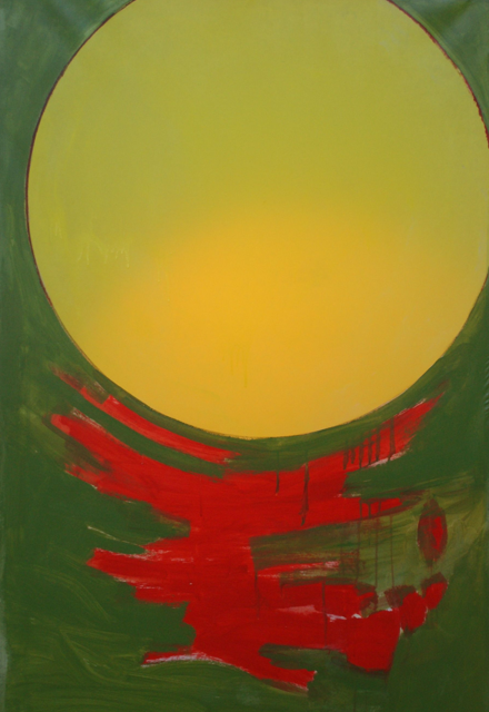
Rothko, in a sense didn't succeed in this because his large rectangular floating forms have a non-flat depth to his brush strokes. Gottlieb, more to the point, began with a set of symbols, which eventually reduced to two--the placid moon over the chaotic earth. It was a great surprise then to read that Tom was trying to do something new rather than going back to his roots.
At the risk of making him feel old, Tom was in art school when the Abstract Expressionists and their off-shoot, the Color Field painters, were in power. The Expressionists, in particular, were not "abstract" at all, being un-interested in simplifying the natural world. They were "non-objective" artists; interested in only paint on surface, without any suggestion of story, narrative, or the real world. Usually, the painting was done in an energetic "action" manner. While appreciating their loose painting method, Tom, like many, preferred to have some structure in his works and sought the proper balance between the two. Here, while leaving his figurative references, the large circles do impose structure (if you look, you can even see the compass holes in the circle's center).
The title: "In the Box" comes from the expression "think outside the box." His notion here is that artists break new ground and ultimately lead their contemporaries to a "new box." Philosophically, I'm going to quibble with my friend here. I don't see any virtue in leading us to a new box any more than leaving us in the old. A box is a box. Further, there have been times when looking at an old master has been a revelation to me, breaking me out of a box that I was in, at least for a time. To nit-pick again, though about the size and shape of the boxes my rag paper comes in, there is nothing about these works that otherwise resembles a box. He states in his artist's statement that he is going from a 2D to a 3D experience.
But here again, I am going to disagree. Looking at a painting on both sides is a somewhat unusual experience, but it is still a flat surface experience. Nor are the views equal, being that the light comes through only one side of the canvas. Solomon said that "there is nothing new under the sun," and two-sided pieces go back at least to the Byzantines, translucent art to the medieval stain glassmakers, and this circle motif at least to Gottlieb. As Picasso said: "There is no new art, nor old art, just good art and bad art."
Okay, so I think the philosophy here is flawed, does that make this a bad show? ABSOLUTELY NOT! Working on a relatively large scale and surrounding the viewer with the pieces achieves a kind of intimacy between the viewer and the color. Walking amongst the works, especially in the center of the gallery with the luminous paintings around me on all sides, I had the sense of being in some modern chapel dedicated to the sun and the moon. It was a lovely, quieting, as well as aesthetic experience; one that I would recommend.
##
This exhibition continues until November 19, with a reception October 21 from 7 to 10 p.m., at the Ronald E. Holstein Gallery (Erie Art Museum Frame Shop located at 423 State St.).